For the creatives among us, wandering the aisles at IKEA ignites a torrent of DIY ideas: The store's bookcases beg to be reimagined as bar carts; white desks can be elevated with new midcentury-modern legs; and a coat of paint would work wonders to transform a dresser. The "after" images always look impressive, but if you're not the handiest among us, they can also seem a tad out of reach.
If you're not DIY-inclined, there are still plenty of low-cost IKEA tips. According to interior designers Elizabeth Lawson, Ohara Davies-Gaetano, Shannon Wollack, and Brittany Zwickl, the secret is all in the way you style the products. With the right high/low mix and careful positioning, IKEA products can look like a million bucks.
Put away your tool kit—these designer-approved styling tricks for every room in your home instantly elevate IKEA décor.
Living Room

Cover furniture: IKEA chairs and sofas have a classic frame, but the fabric and color can instantly give away the inexpensive price tag. Enter Bemz, a company that specializes in high-quality covers for IKEA furniture. Transform a basic piece, like this Mellby chair, with a blush-pink cotton cover for an instant upscale look.
Layer rugs: Elevate an inexpensive jute rug by layering it with a statement accent piece. Lawson says it's as simple as following three steps: "Start with a flat-weave, jute, or sisal that will provide some texture. Over that, layer a rug with some pattern and color, whether it's a flat-weave or it has a higher pile," she says.
Make sure that the top rug covers around three-quarters of the natural-fiber rug underneath.
Style accessories in odd numbers: An inexpensive vase or planter can look out of place when styled on its own. Instead, buy three similar items, all in varying heights. Style them in odd numbers to create vignettes that look like carefully chosen pieces, not cheap impulse buys.
Bedroom

Incorporate vintage pieces: Disguise a recognizable flat-pack dresser by introducing vintage finds to your bedroom. "Layering is key to add interest and personality to a plain piece of furniture. It is really important to mix together elements that are not as new and perfect," says Davies-Gaetano. She recommends adding an antique gilt mirror or an abstract modern painting to create "moments of personality."
Splurge on accent pillows: "Basic white bedding is available almost anywhere," Lawson says, making it an ideal piece to buy at IKEA. "Save your pennies and splurge on some really amazing accent pillows and a cozy throw that will add some color and texture," she says.
Add organic accessories: Offset IKEA's signature white melamine furniture with organic accessories, Lawson says. This will create visual interest that draws your gaze to personal curios, rather than inexpensive base furniture. "To make a plain white dresser feel a little more special, add a tray in an organic material like marble or wood," she recommends.
Bathroom

Choose one storage style: Mismatched storage containers like woven baskets, plastic bins, and glass jars look instantly cheap and messy. Instead, Lawson recommends choosing one style and buying multiple pieces so it looks elegant and considered. "Get a few of the same basket and line them up for a uniform look," she says. "I like my bathroom to feel polished and clean, so I opt for solid linen-wrapped boxes as opposed to baskets, and I like using ceramic canisters as opposed to see-through glass."
Edit accessories: While the bedroom is all about adding and layering accessories, the bathroom follows the opposite approach, says Wollack. "The less clutter there is, the better." Don't get carried away by buying a ton of inexpensive toothbrush holders, cups, and soap dispensers. Keep accessories to a minimum and reduce countertop clutter by grouping small items in trays.
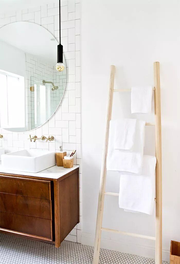
Put towels on display: The way you choose to display items in your home carries subtle messages about their value. Crisp white IKEA towels look instantly more expensive hung on a wooden ladder or folded carefully on open shelves.
Kitchen

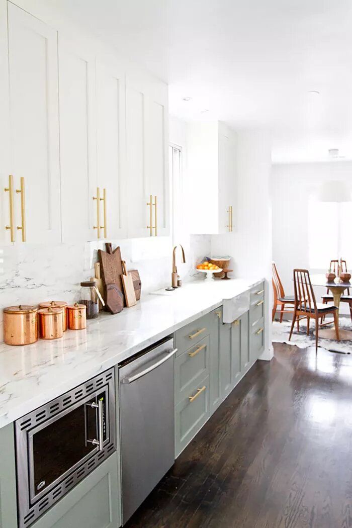
Upgrade hardware: "Save on the actual cabinetry, especially since they all serve the same purpose," says Zwickl. Instead, Wollack says to turn your attention to hardware: "Swapping out your basic IKEA pulls with unique hardware is a great way to update any cabinetry to make it more refined." She recommends pulls with a leather or rope detail, or brass-and–matte black hardware to create a "refined and clean-lined look."
Replace cabinet doors: Sherman Samuel swapped out the doors of her IKEA cabinets for refined ones by SemiHandmade, a company that specializes in customizing IKEA products. Hire someone via TaskRabbit for a new-look kitchen without lifting a tool.
Invest in statement lighting: Draw the gaze upward and away from basic kitchen cabinets by choosing statement lights. "For me, lighting in a kitchen is extremely important," Lawson says. "Save by opting for a quartz marble look-alike [countertop], and put your money into the finishes that are going to really make the space, like pendant lighting and sconces."
Dining Room

Pay attention to the silhouette: IKEA chairs and tables usually have a straight-line, boxy silhouette. That's fine as a base piece, but be sure to add curved, organic-shaped furniture to balance it out. These architectural Panton chairs instantly elevate a basic white dining table.
Update artwork: You don't need to spend a lot of money on frames. Instead, turn your attention to sourcing artwork that adds personality and color to the room. Zwickl recommends Society6 and Max Wagner artwork for affordable art, while Lawson says she turns to Minted and Eventide Collective for special, well-priced finds.
Layer accessories: An inexpensive accessory, such as a vase or planter, looks instantly more luxe when layered on top of another item. Use a tray as a base to elevate a simple glass vase of flowers, or give a basic planter height with a geometric stand.
*Article written by


